Is on the Club website now.
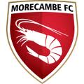
A big shrimp on a shield!
Looks OK I think.
New club crest
82 posts
• Page 1 of 4 • 1, 2, 3, 4
New club crest
![]() by Crazeenick » Tue Feb 09, 2010 10:16 am
by Crazeenick » Tue Feb 09, 2010 10:16 am
-

Crazeenick - Posts: 1388
- Joined: Sat Jun 28, 2008 12:02 pm
- Location: Torrisholme
Re: New club crest
![]() by drinkduffbeers » Tue Feb 09, 2010 10:18 am
by drinkduffbeers » Tue Feb 09, 2010 10:18 am
That looks awesome. Bang up to date
Well done to everyone involved
Well done to everyone involved
-

drinkduffbeers - Posts: 92
- Joined: Sat Jan 24, 2009 12:26 pm
- Location: Preston
Re: New club crest
![]() by Blackpool Shrimp » Tue Feb 09, 2010 10:19 am
by Blackpool Shrimp » Tue Feb 09, 2010 10:19 am
Simple design but stands out and is very effective
- Blackpool Shrimp
- Posts: 3606
- Joined: Wed Jul 15, 2009 11:11 pm
- Location: Blackpool
Re: New club crest
![]() by burple » Tue Feb 09, 2010 10:19 am
by burple » Tue Feb 09, 2010 10:19 am
I think it looks terrible  maybe the worst club crest I've ever seen?
- burple
- Posts: 158
- Joined: Tue Jan 06, 2009 4:27 pm
Re: New club crest
![]() by P/T Indie » Tue Feb 09, 2010 10:20 am
by P/T Indie » Tue Feb 09, 2010 10:20 am
How imaginative
I don't like it
When you look at the end of era crest which we designed which is very good IMO the shrimp crest looks very average compared to it.
I don't like it
When you look at the end of era crest which we designed which is very good IMO the shrimp crest looks very average compared to it.
Last edited by P/T Indie on Tue Feb 09, 2010 2:32 pm, edited 1 time in total.
Eintracht Branschweigs answer to Shrimps Voices
http://eintracht-demo.forumieren.com/index.htm
For a great footballing day out
http://eintracht-demo.forumieren.com/index.htm
For a great footballing day out
- P/T Indie
- Posts: 3878
- Joined: Thu Jun 26, 2008 3:54 pm
Re: New club crest
![]() by heysham_mfc » Tue Feb 09, 2010 10:22 am
by heysham_mfc » Tue Feb 09, 2010 10:22 am
only been out 20 mins and have allready seen people saying they like it and some that don't like it at all! think that it is a good logo simple but it stands out so then when can we cuy stuff with this new crest on think shirt sales of next season will be quite popular
- heysham_mfc
- Posts: 5320
- Joined: Mon Jun 23, 2008 3:22 pm
- Location: Heysham
Re: New club crest
![]() by burple » Tue Feb 09, 2010 10:28 am
by burple » Tue Feb 09, 2010 10:28 am
that cant honestly of been done by a professional? I could of done better on MS paint in 10 mins. It really couldn't be any worse... I thought my mate was taking the piss when he sent that on email
oh the shame
oh the shame
- burple
- Posts: 158
- Joined: Tue Jan 06, 2009 4:27 pm
Re: New club crest
![]() by Blackpool Shrimp » Tue Feb 09, 2010 10:29 am
by Blackpool Shrimp » Tue Feb 09, 2010 10:29 am
Totally agree with you there heysham i think the shirts will be great sellers as first shirt at new ground and also with new crest i for one will be buying home and away ones
- Blackpool Shrimp
- Posts: 3606
- Joined: Wed Jul 15, 2009 11:11 pm
- Location: Blackpool
Re: New club crest
![]() by Heysham_red » Tue Feb 09, 2010 10:36 am
by Heysham_red » Tue Feb 09, 2010 10:36 am
"So its not a joke, thats horrendous" not my words, but the words of my friend who sits next to me. I think the shield is spot on but I think the shrimp in the middle is pretty poor. A modern design no doubt but I have to say I am not a fan!
- Heysham_red
- Posts: 262
- Joined: Mon Jun 30, 2008 8:23 am
Re: New club crest
![]() by Old Man Kensey » Tue Feb 09, 2010 10:41 am
by Old Man Kensey » Tue Feb 09, 2010 10:41 am
Well I like it! Simple design with a modern twist, reminds me of what Arsenal did.
On a machine like this
Everybody gets their hands oily
Everybody gets their hands oily
-
Old Man Kensey - Posts: 962
- Joined: Mon Jun 23, 2008 11:31 am
Re: New club crest
![]() by Duffman » Tue Feb 09, 2010 10:47 am
by Duffman » Tue Feb 09, 2010 10:47 am
Whoever designed the logo has completely failed in what they were trying to create in my opinion. I can see they were going for an Arsenal/Fulham minimal design but I think they're way off the mark.
Default football logo comes to mind.
Default football logo comes to mind.
-

Duffman - Posts: 753
- Joined: Sat Aug 16, 2008 9:49 pm
- Location: Heysham
Re: New club crest
![]() by Keith » Tue Feb 09, 2010 10:51 am
by Keith » Tue Feb 09, 2010 10:51 am
burple wrote:I think it looks terrible

It might grow on me... eventually...
“Britain faces a simple and inescapable choice - stability and strong Government with me, or chaos with Ed Miliband: ".
David Cameron. May 4th 2015.
So how did that work out then?
David Cameron. May 4th 2015.
So how did that work out then?
-

Keith - Site Admin
- Posts: 23343
- Joined: Wed Jun 18, 2008 3:39 pm
- Location: Isle of Man
Re: New club crest
![]() by burple » Tue Feb 09, 2010 10:51 am
by burple » Tue Feb 09, 2010 10:51 am
they say they listened to fans, looks like everyone has said we would like a shrimp on it. so they gone "bosh a bloody big shrimp, our name job done"
it cant actually of taken any more though than that, it couldn't be any worse, it's not a little bit bad it's truely shocking
it cant actually of taken any more though than that, it couldn't be any worse, it's not a little bit bad it's truely shocking
- burple
- Posts: 158
- Joined: Tue Jan 06, 2009 4:27 pm
Re: New club crest
![]() by wonder shrimp » Tue Feb 09, 2010 11:04 am
by wonder shrimp » Tue Feb 09, 2010 11:04 am
i hadn't seen it until the bottom of the thread, i was expecting a lot worse! FWIW i actually think it looks ok, like a kind of wonderful shrimp *cough*

- wonder shrimp
Re: New club crest
![]() by fletch_al » Tue Feb 09, 2010 11:06 am
by fletch_al » Tue Feb 09, 2010 11:06 am
i like the modern crest but not so much a fan of the massive shrimp.
- fletch_al
- Posts: 556
- Joined: Wed Jul 02, 2008 1:34 pm
Re: New club crest
![]() by drinkduffbeers » Tue Feb 09, 2010 11:08 am
by drinkduffbeers » Tue Feb 09, 2010 11:08 am
burple wrote:they say they listened to fans, looks like everyone has said we would like a shrimp on it. so they gone "bosh a bloody big shrimp, our name job done"
it cant actually of taken any more though than that, it couldn't be any worse, it's not a little bit bad it's truely shocking
Just because it's simple dosent mean any less man hours went into the design.
Genius
-
drinkduffbeers - Posts: 92
- Joined: Sat Jan 24, 2009 12:26 pm
- Location: Preston
Re: New club crest
![]() by Muzzer » Tue Feb 09, 2010 11:12 am
by Muzzer » Tue Feb 09, 2010 11:12 am
The worst Crest/ Emblem Ever!!
Honestly this is THE worst thing i have ever seen.. seriously. And to be honest i think some people could make a better one on a football game. Very very poor!!
Honestly this is THE worst thing i have ever seen.. seriously. And to be honest i think some people could make a better one on a football game. Very very poor!!
I can win a game of connect four in three moves 
- Muzzer
- Posts: 77
- Joined: Sun Jun 29, 2008 1:51 pm
Re: New club crest
![]() by yozzer » Tue Feb 09, 2010 11:27 am
by yozzer » Tue Feb 09, 2010 11:27 am
Let's have a look at your alternative design burple. You have ten minutes on paintbrush to come up with a better design. 
- yozzer
- Posts: 166
- Joined: Sat Jun 28, 2008 10:33 am
Re: New club crest
![]() by burple » Tue Feb 09, 2010 11:35 am
by burple » Tue Feb 09, 2010 11:35 am
will do tonight no problem, mine will be just as bad as that easy
- burple
- Posts: 158
- Joined: Tue Jan 06, 2009 4:27 pm
Re: New club crest
![]() by Burnley Shrimp » Tue Feb 09, 2010 11:38 am
by Burnley Shrimp » Tue Feb 09, 2010 11:38 am
I'ts a talking point!!
Minimalistic!
Maybe the Shrimp heading a football might have been better?
Minimalistic!
Maybe the Shrimp heading a football might have been better?
- Burnley Shrimp
- Posts: 508
- Joined: Fri Sep 26, 2008 6:56 pm
Re: New club crest
![]() by marky No.1 » Tue Feb 09, 2010 11:41 am
by marky No.1 » Tue Feb 09, 2010 11:41 am
Burnley Shrimp wrote:Maybe the Shrimp heading a football might have been better?
Or even one kicking it over the stand!!
Enjoy yourself.... It is later than you think
-
marky No.1 - Posts: 22592
- Joined: Thu Jun 26, 2008 4:09 pm
- Location: Carnforth
Re: New club crest
![]() by Trevor » Tue Feb 09, 2010 11:44 am
by Trevor » Tue Feb 09, 2010 11:44 am
Nah! That would be tacky and cartoony Burnley. Its our nickname, its who we are. Be proud of it.
ANY club can have footballs on - any in Lancashire could have a red rose, any on the coast could have a boat.
Southend are the only other ones who have a connection with shrimps - have a look at their badge if you want to see a bad one! Complicated (so it should please burple) - but terrible. Tranmere's another - lots going on so pretty intricate, but horrible.
simple, instantly recognisable and bold is best - a look at most of the leading world brands should tell you that.
- Trevor
- Posts: 217
- Joined: Mon Jun 30, 2008 10:57 pm
Re: New club crest
![]() by Old Man Kensey » Tue Feb 09, 2010 11:48 am
by Old Man Kensey » Tue Feb 09, 2010 11:48 am
On a machine like this
Everybody gets their hands oily
Everybody gets their hands oily
-
Old Man Kensey - Posts: 962
- Joined: Mon Jun 23, 2008 11:31 am
Re: New club crest
![]() by ezz » Tue Feb 09, 2010 11:49 am
by ezz » Tue Feb 09, 2010 11:49 am
I think it looks pretty good, modern, simple and will look good on the shirt. It does look like it needs something on the bottom as having the Morecambe FC at the top in bald does look a bit amateur. Even if it just said, 'bring me sunshine' on the bottom in small letters. But apart from that I think its fine.
Get over it
- ezz
- Posts: 2682
- Joined: Sat Aug 09, 2008 7:56 pm
- Location: Morecambe
Re: New club crest
![]() by Burnley Shrimp » Tue Feb 09, 2010 11:55 am
by Burnley Shrimp » Tue Feb 09, 2010 11:55 am
ezz wrote:I think it looks pretty good, modern, simple and will look good on the shirt. It does look like it needs something on the bottom as having the Morecambe FC at the top in bald does look a bit amateur. Even if it just said, 'bring me sunshine' on the bottom in small letters. But apart from that I think its fine.
Good idea Ezz. Bring me sunshine would be great tagged on the bottom. Not the bottom of the Shrimp, the bottom of the badge! Maybe the Shrimp looking up at a huge sun as well. Plus heading a football!
- Burnley Shrimp
- Posts: 508
- Joined: Fri Sep 26, 2008 6:56 pm
82 posts
• Page 1 of 4 • 1, 2, 3, 4
Who is online
Users browsing this forum: Bing [Bot] and 29 guests